
Introduction
This project explores the analysis of large-scale COVID-19 epidemiological data using various data science techniques, focusing on frequent pattern mining, contrast pattern mining, and K-Means clustering. The goal is to uncover significant insights regarding the spread, impact, and trends of COVID-19 based on demographic factors like gender, age, and state.
Graph -1
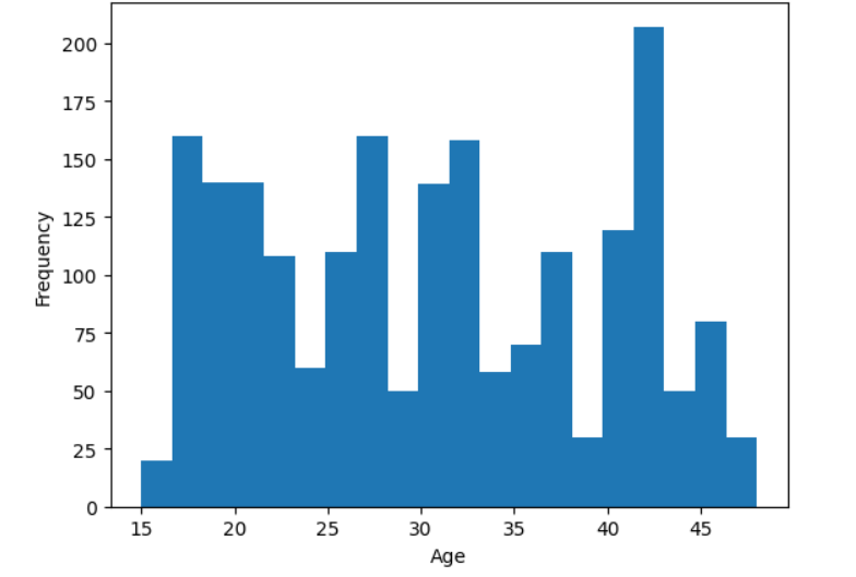
The histogram provides insights into the distribution of ages within the dataset. The x-axis represents different age groups, while the y-axis indicates the frequency of occurrences for each age range. By analyzing the shape of the histogram, we can determine whether the data is normally distributed, skewed towards younger or older individuals, or contains any outliers. A peak in the histogram suggests the most common age group, while gaps or isolated bars may indicate missing values or anomalies. This visualization helps in understanding the overall age demographics and identifying any patterns or irregularities in the data.
Graph -2
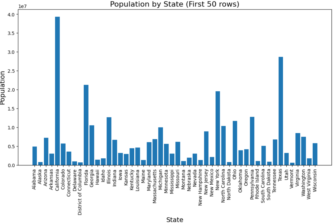
This bar chart visualizes the total population for each state based on the first 50 rows of the dataset. The x-axis represents the different states, while the y-axis shows the total population for each state by summing the values in the Population column
From the chart, we can observe which states have the highest and lowest populations within this subset of data. If certain states have significantly taller bars, it indicates a higher concentration of population in those states. The rotation of x-axis labels ensures clarity in reading the state names. However, since the data is limited to the first 50 rows, the insights might not represent the full dataset's actual distribution.
Graph -3
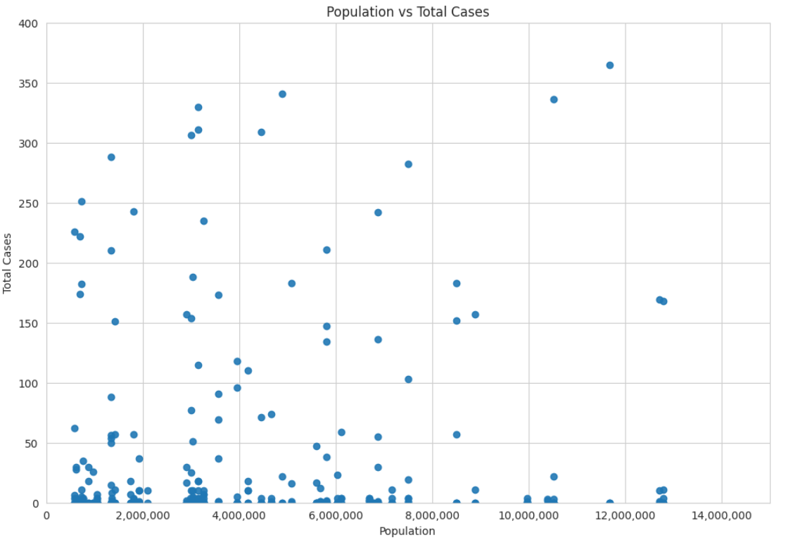
This scatter plot visualizes the relationship between Population and Total Cases in the dataset. Each point represents a data entry, with the x-axis corresponding to the population size and the y-axis indicating the number of total cases.
From this plot, we can analyze whether there is a correlation between population size and the number of cases. If the points form an upward trend, it suggests that higher population states tend to have more cases. If the data points are widely dispersed without a clear pattern, it indicates a weaker correlation. The axis limits ensure readability, and the number formatting improves clarity by making large values easier to interpret.